

Health Dashboard
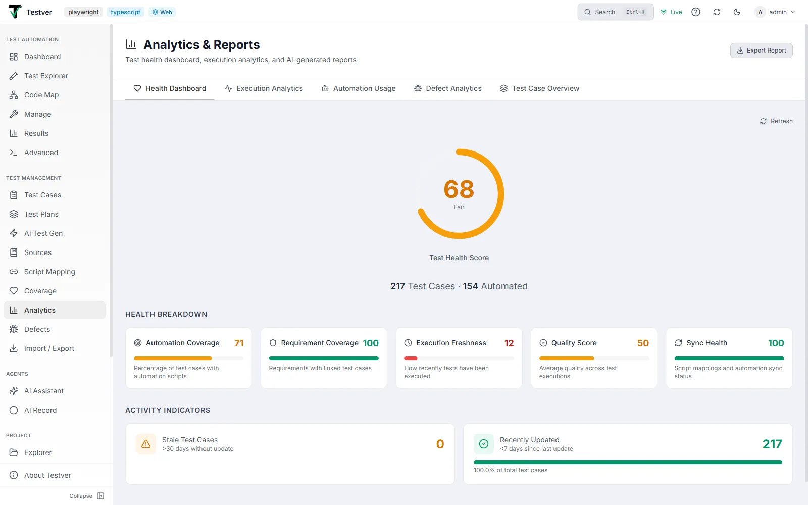
The Health Dashboard tab of the Analytics screen.
The default tab. It answers one question: how healthy is my test suite overall? A small Refresh link sits at the top-right to re-pull the latest figures.
Test Health Score
Section titled “Test Health Score”A large circular gauge fills clockwise from 0 to 100. The number in the centre is the overall score and the word beneath it is its band. The ring and number are colour-coded so you can read health at a glance.
| Score range | Label | Colour |
|---|---|---|
| >= 90 | Excellent | Green |
| 75 - 89 | Good | Green |
| 50 - 74 | Fair | Amber |
| 25 - 49 | Poor | Red |
| < 25 | Critical | Red |
Below the ring, a summary line reads N Test Cases - M Automated, giving immediate context for the score.
Health Breakdown
Section titled “Health Breakdown”Five cards explain why the overall score is what it is. Each card shows the metric name, its 0-100 score (green/amber/red), a progress bar and a one-line description. Together they roll up into the overall ring.
| Metric | Meaning |
|---|---|
| Automation Coverage | Percentage of test cases that have automation scripts. |
| Requirement Coverage | Requirements that have linked test cases. |
| Execution Freshness | How recently tests have been executed. |
| Quality Score | Average quality across test executions. |
| Sync Health | Script mappings and automation sync status. |
Activity Indicators
Section titled “Activity Indicators”Two cards flag movement in your suite. Each shows a count, and when the count is above zero a progress bar shows what share of total test cases it represents.
| Indicator | Meaning |
|---|---|
| Stale Test Cases (amber) | Test cases with more than 30 days since their last update. A high number suggests neglected coverage. |
| Recently Updated (green) | Test cases updated in the last 7 days - a sign of active maintenance. |
Related
Section titled “Related”- Analytics overview — the screen and its tabs.