

Coverage Dashboard Tab
The Coverage Dashboard Tab of the Coverage screen.
This is the metrics tab — five stat cards on top, then two breakdown panels.
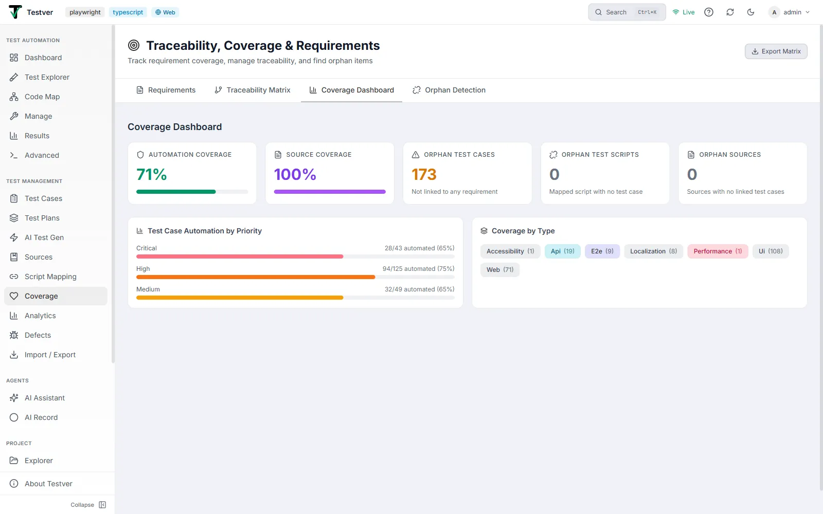
The stat cards
Section titled “The stat cards”| Card | Meaning | Color |
|---|---|---|
| Automation Coverage | Percent of test cases that are automated (mapped to a script). The headline metric. | Green % with a green progress bar |
| Source Coverage | Percent of sources that have produced test cases. | Purple % with a purple progress bar |
| Orphan Test Cases | Count of test cases not linked to any requirement. | Amber if > 0, gray if 0 |
| Orphan Test Scripts | Count of mapped scripts whose test case no longer exists (broken script links). | Orange if > 0, gray if 0 |
| Orphan Sources | Count of sources with zero test cases via any path (generated or manually linked). | Purple if > 0, gray if 0 |
Automation by priority
Section titled “Automation by priority”A horizontal-bar panel. For each priority that has test cases, it shows automated / total and the percent, with a bar filled to that percent. Priorities are ordered Critical -> High -> Medium -> Low and bar-colored rose (critical), orange (high), amber (medium), emerald (low). Priorities with no test cases are hidden; if there are none at all it reads “No test cases yet.”
Test cases by type
Section titled “Test cases by type”A set of colored pills, one per test-case type that has at least one case, each showing the type name and its count, e.g. Functional (12), Regression (5). Type colors: functional sky, regression violet, smoke amber, integration teal, e2e indigo, api cyan, performance rose, security red. If there is no data it reads “No type distribution data available.”
Related
Section titled “Related”- Coverage overview — the screen and its tabs.