

My Reports tab
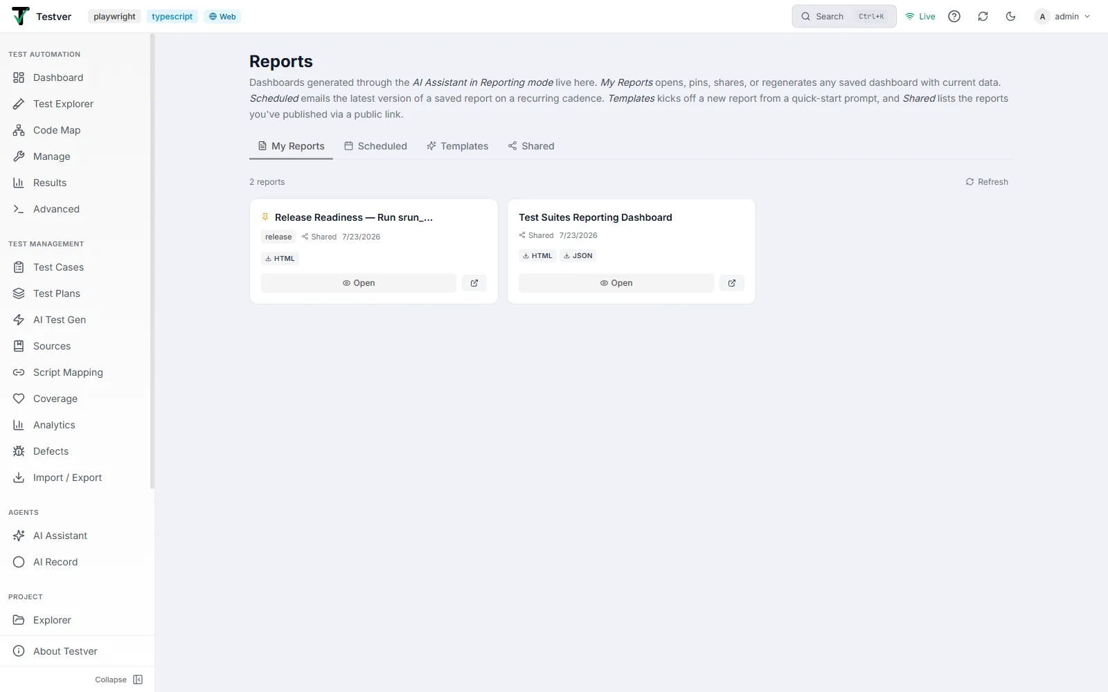
The My Reports tab of the Reports screen is where your saved dashboards live. It is the tab the screen opens on.
Anatomy of a report card
Section titled “Anatomy of a report card”On the My Reports tab each saved report is a card. The card columns and elements are:
| Element | Where | What it shows / does |
|---|---|---|
| Pin marker | Top-left of card | An amber Pin icon appears only when the report is pinned. |
| Title | Top of card | The report’s title, truncated if long. |
| Pin / Unpin button | Top-right (on hover) | Toggles favourite state. Tooltip reads Pin or Unpin. |
| Share button | Top-right (on hover) | Creates a public link (copies it to your clipboard) or, if already shared, revokes it. Turns emerald-green when a link is active. |
| Delete button | Top-right (on hover) | Opens a confirmation dialog to permanently delete the report. |
| Template badge | Metadata row | A small brand-coloured pill showing the templateId, if the report was built from a template. |
| Shared indicator | Metadata row | A “Shared” label with a share icon when a share token is active. |
| Updated date | Metadata row | The report’s updatedAt date, localised. |
| Download pills | Below metadata | One pill per available format: always html, plus pdf, docx, xlsx, json when those output files exist. Each opens in a new tab. |
| Open button | Bottom of card | Navigates to the full-view page /reports/view/<id> (eye icon). |
| Open-share button | Bottom of card | Only when shared: an external-link icon that opens the public share URL in a new tab. |
The report count
Section titled “The report count”- The left of the toolbar shows the count: e.g. 3 reports (singular “1 report” when there is exactly one).
- The right shows a Refresh button. Click it to re-fetch the list from the server. While refreshing the icon spins and the label reads Refreshing….
- On a manual refresh the existing cards stay on screen (no flash to empty) — only the first load shows the full “Loading reports…” splash.
Viewing a report
Section titled “Viewing a report”Opening a report
Section titled “Opening a report”- On a report card, click Open (the eye icon). You navigate to
/reports/view/<id>. - The page shows a brief “Loading report…” spinner, then renders the dashboard at full width.
- If the report can’t be loaded you’ll see a Could not load report panel with the error and a Back to Reports link.
Report actions
Section titled “Report actions”| Action | Icon | What it does |
|---|---|---|
| Back to Reports | Arrow-left | Returns to the /reports catalogue. |
| Reload | Refresh | Re-fetches the SAVED snapshot from the server. Chart values stay the same unless someone edited the saved report. Shows a spinning icon and “Reloading…” without blanking the rendered report. |
| Regenerate with current data | Sparkles | Re-runs the AI workflow that built the dashboard so the KPI/chart/table values reflect the CURRENT state of Testver. The id, share link, and pin state are preserved — only the spec values change. Takes roughly 30 seconds to a couple of minutes; the button shows “Regenerating…” and both Reload and Regenerate are disabled while it runs. |
| Delete | Trash | Opens a confirm dialog; on confirm the report is permanently deleted and you return to the catalogue. |
The dashboard grid and cell types
Section titled “The dashboard grid and cell types”The report body is a 12-column grid of cells. The full-view page renders exactly the same ReportCard component used in chat, so what you see is identical. The four cell types are:
| Section / cell type | What it shows |
|---|---|
| KPI tile | A single headline metric — a value with an optional unit, an optional delta (change vs a prior period), and an up/down/flat direction. The delta is coloured green or red depending on whether that direction is “good”. Default width: 3 of 12 columns (four per row). |
| Chart | A titled chart in one of six types: line, bar, stacked_bar, pie, doughnut, or horizontal_bar. Supports single-series data or multiple datasets, with colour schemes (vibrant, pastel, status, priority, severity). Default width: 6 of 12 columns (two per row). May include a hint line beneath. |
| Table | A titled data table with column headers and rows; numbers are right-tabulated. Shows “No rows” when empty. Default width: full (12 columns). May include a hint line beneath. |
| Markdown | A narrative note rendered from lightweight markdown — supports headings, bullet lists, bold, and inline code. Used for executive summaries and Go/No-Go recommendations. Default width: full (12 columns). |
Each cell can override its width via a span value (clamped to 1–12). On narrow screens all cells stack to full width.
The report header and action bar
Section titled “The report header and action bar”Above the grid, the ReportCard header shows the report title, an optional subtitle, and a Generated timestamp. To the right is an action bar:
| Header action | What it does |
|---|---|
| Save (bookmark) | Saves an unsaved dashboard to your reports. Hidden once the report is already saved (and always hidden in the public read-only share view). Turns into a filled check-bookmark when saved. |
| Share / Revoke (share icon) | Creates a public share link (saving the report first if needed) or, when one exists, toggles a panel to view/copy/revoke it. Hidden in read-only share view. |
| Open full view (external link) | Opens the best available URL in a new tab — the public share URL if shared, else the /reports/view/<id> page, else the static HTML snapshot. |
| Download (download icon) | Downloads the HTML report. For saved or shared reports this uses the fresh-render endpoint so charts are always real inline SVG; the public share view uses the public render endpoint so anonymous viewers aren’t blocked. |
| Copy link (link icon) | Copies the interactive URL to the clipboard (share URL when shared, full-view URL when saved, HTML snapshot otherwise). Shows a green check briefly on success. |
Downloading other formats
Section titled “Downloading other formats”- From a report card (My Reports / Shared): use the format pills — html (always present, fresh-rendered) plus pdf, docx, xlsx, json when those files exist.
- From the full view header: the Download icon downloads the HTML report (filename
<spec-id>.html). - Owner-gated downloads append your auth token as a
?token=query parameter automatically, because a plain link can’t send an Authorization header — this is what lets the file open without a 401.
Related
Section titled “Related”- Reports overview — the screen and its four tabs.
- Shared tab — reports with a public link.
- Templates tab — quick-start presets.
- AI Assistant — where reports are generated, in Reporting mode.